Blocks
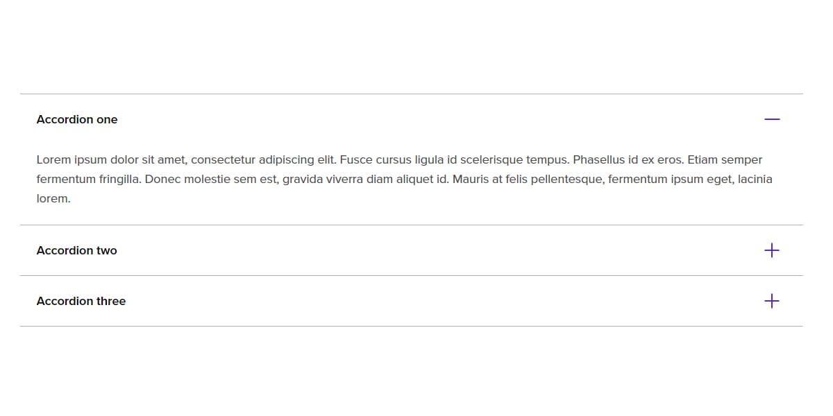
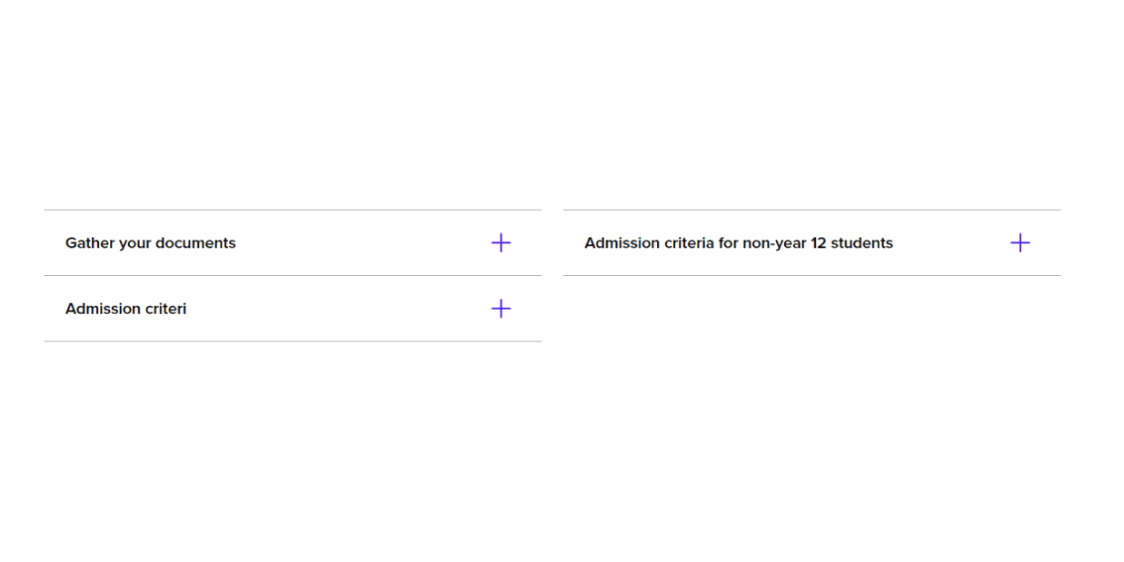
Accordion
Large amounts of text can be hidden within an accordion to decrease the length of a webpage.
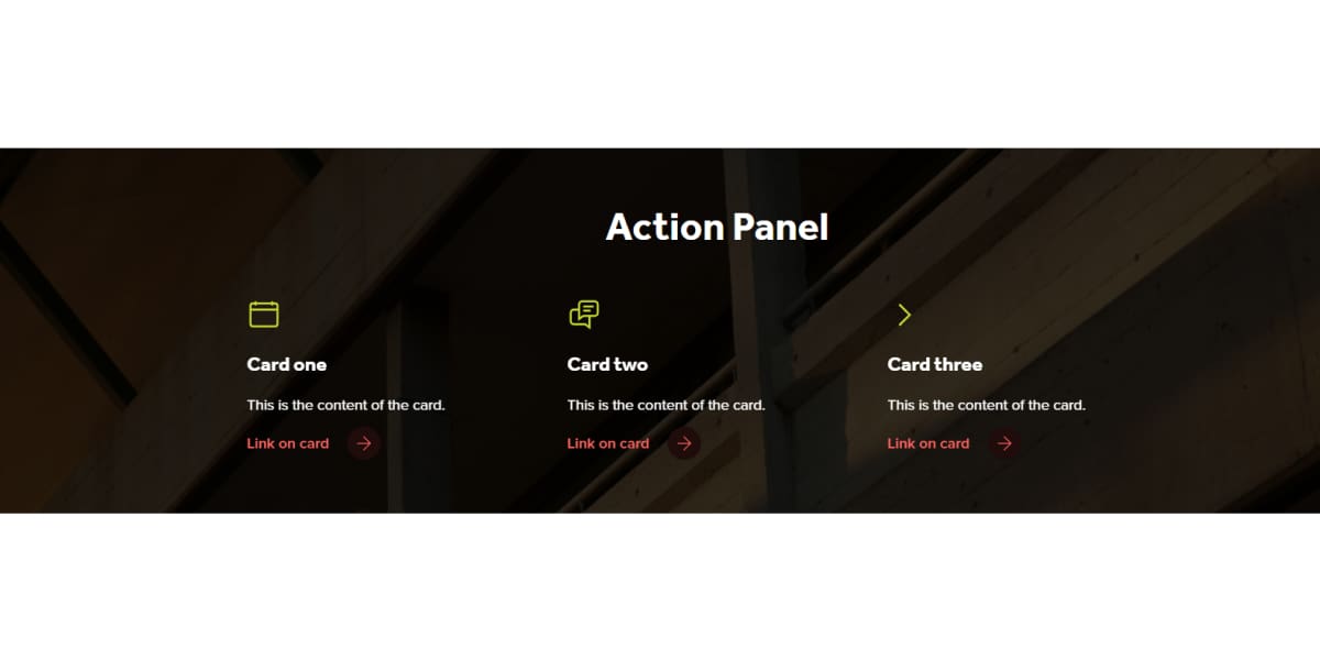
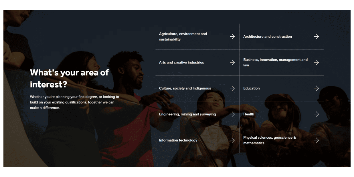
Action panel
The action panel is used to display or highlight Curtin’s unique selling points (USPs).
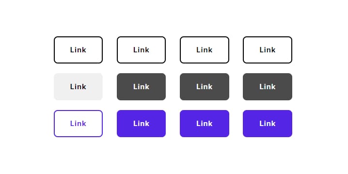
Buttons
Add stand-alone buttons to a page. You have the option to select the colour, alignment and margin of the buttons.
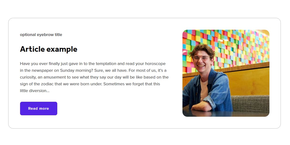
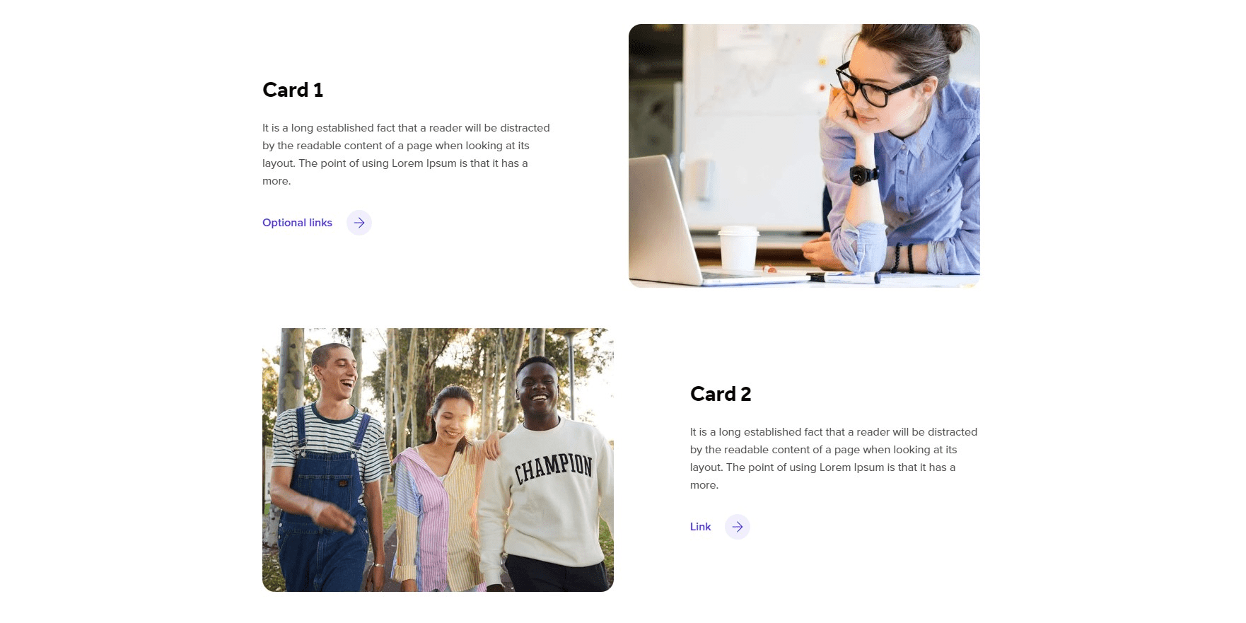
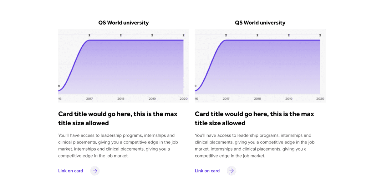
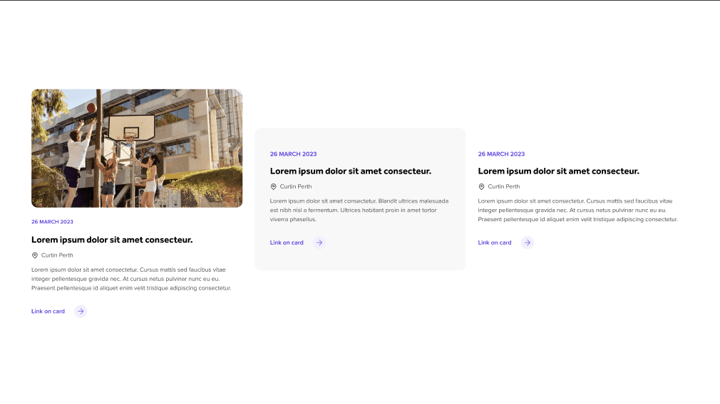
Cards
Cards allow you to surface a number of items in a ‘card’ like design in multiple columns.
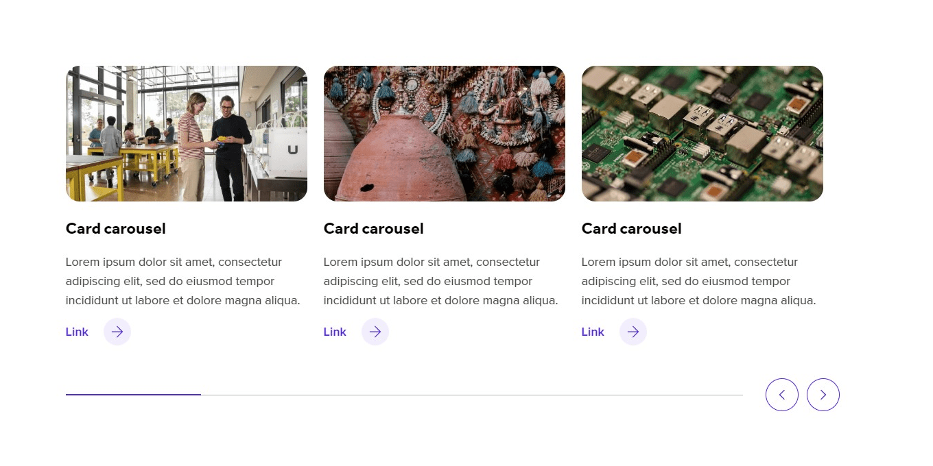
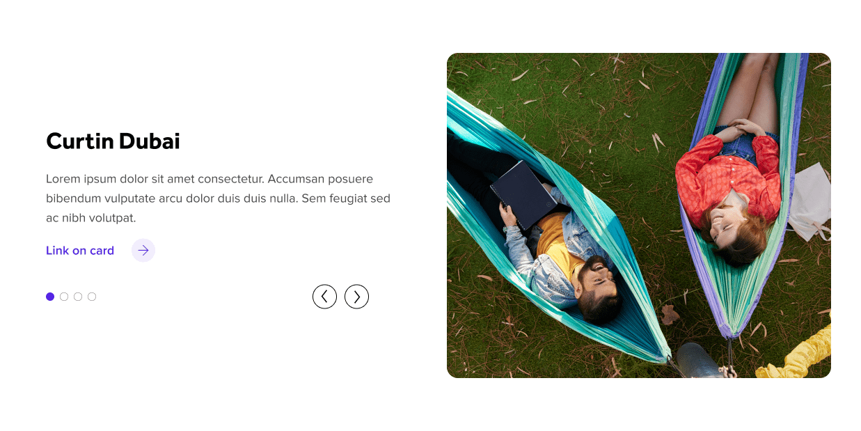
Card carousel
A carousel of cards that can be used when there are more than four cards to display.
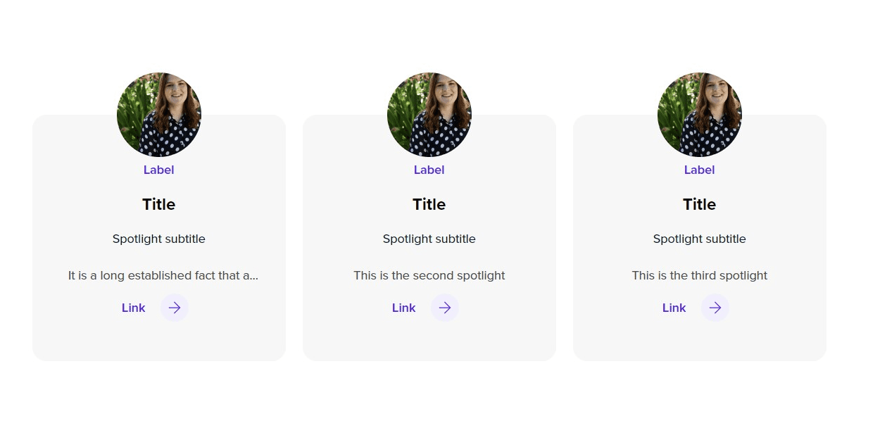
Card spotlight
Card spotlights are small profile blocks used on certain pages to display individuals at Curtin.
Checkered items
Checkered items are a great way to display or highlight Curtin’s unique selling points (USPs). They do not have a call-to-action.
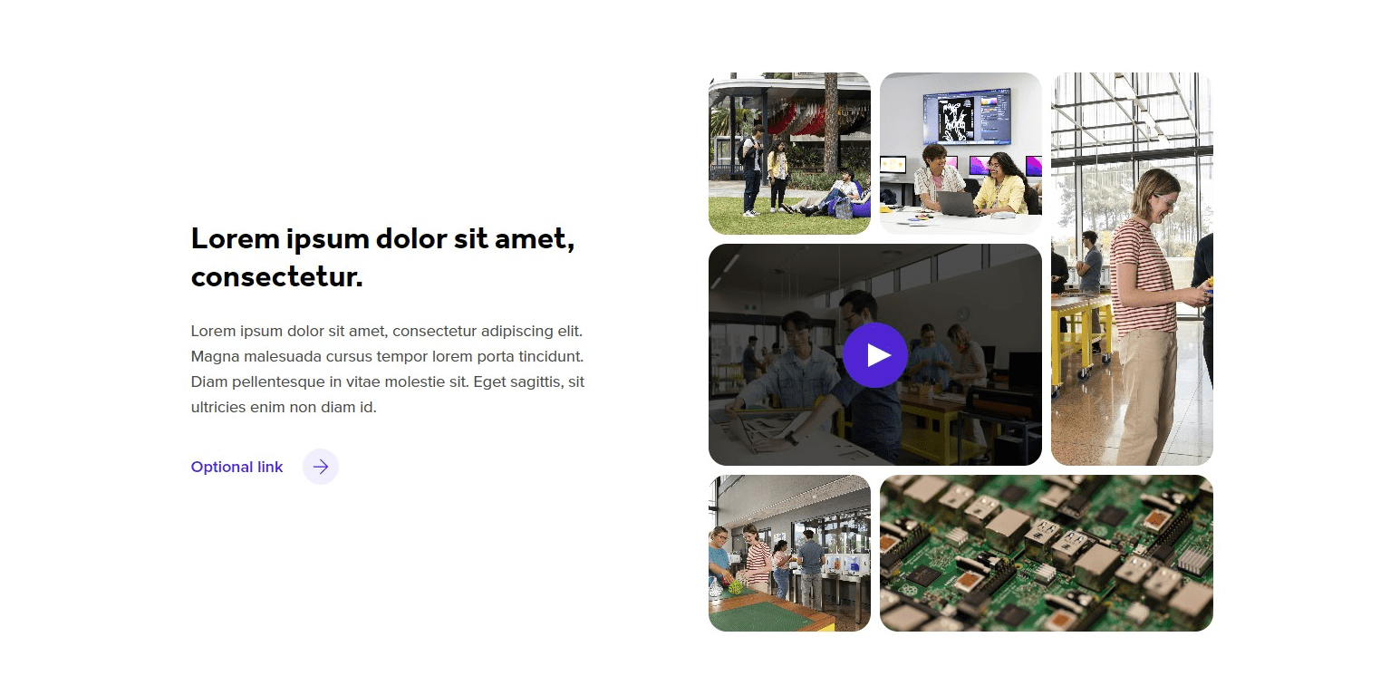
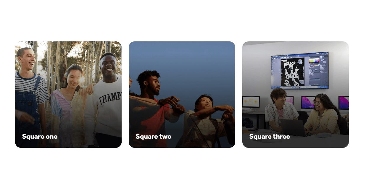
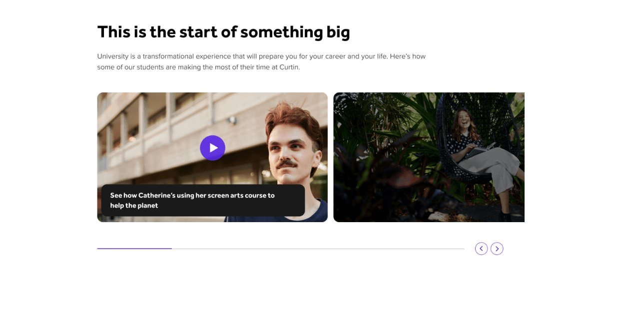
Collage block
The Collage block is designed to display multiple photos and videos to portray the experience of Curtin.
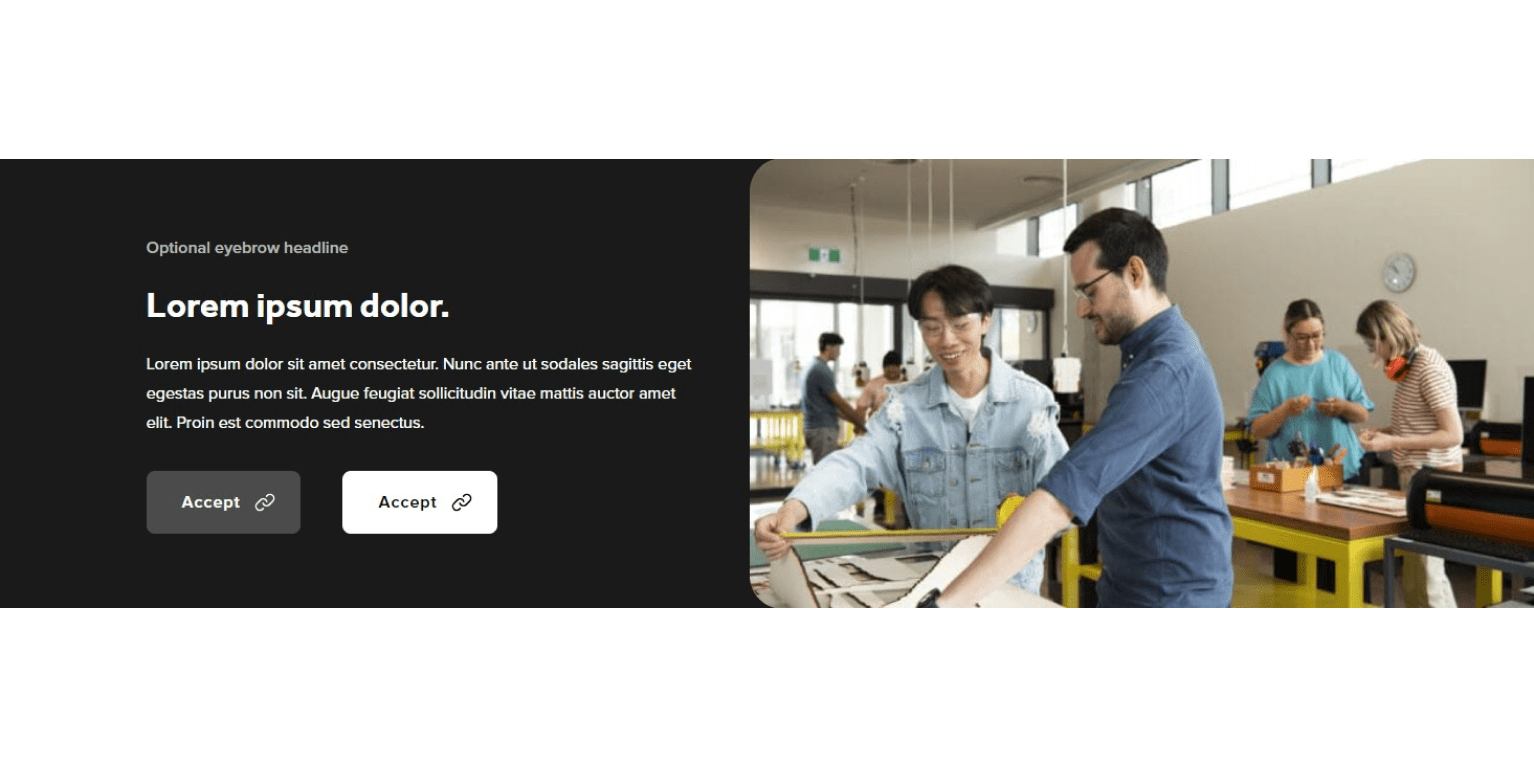
CTA Banner
A CTA Banner is used to highlight content that requires a single call-to-action.

Description list
This block is used to display lists grouped by a heading and a small image.

Facts
The Facts blocks are used to display single facts about Curtin along with a related icon and short description.
Hover content
This block can be used to showcase multiple links to other related pages or external entities.
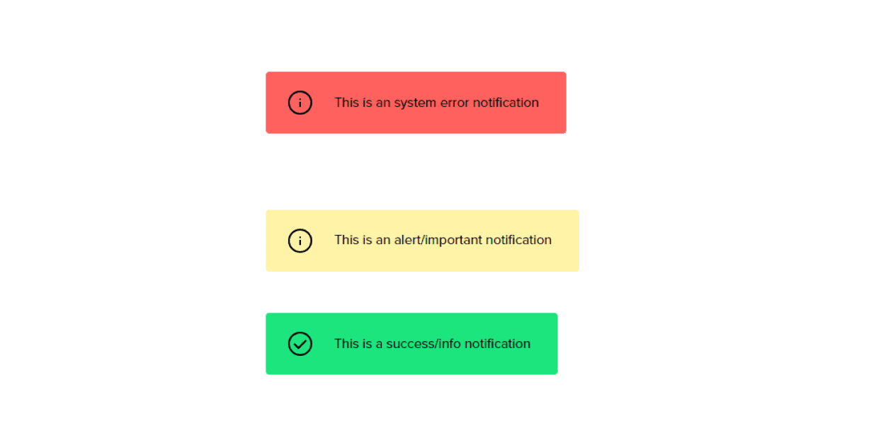
Notices
Notices are to be used to display important information, system errors or success notices.
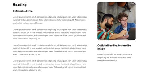
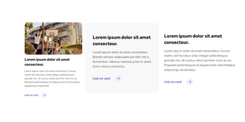
Columns (Paragraph block)
The columns block is used to display a large body of text with a heading and optional image.
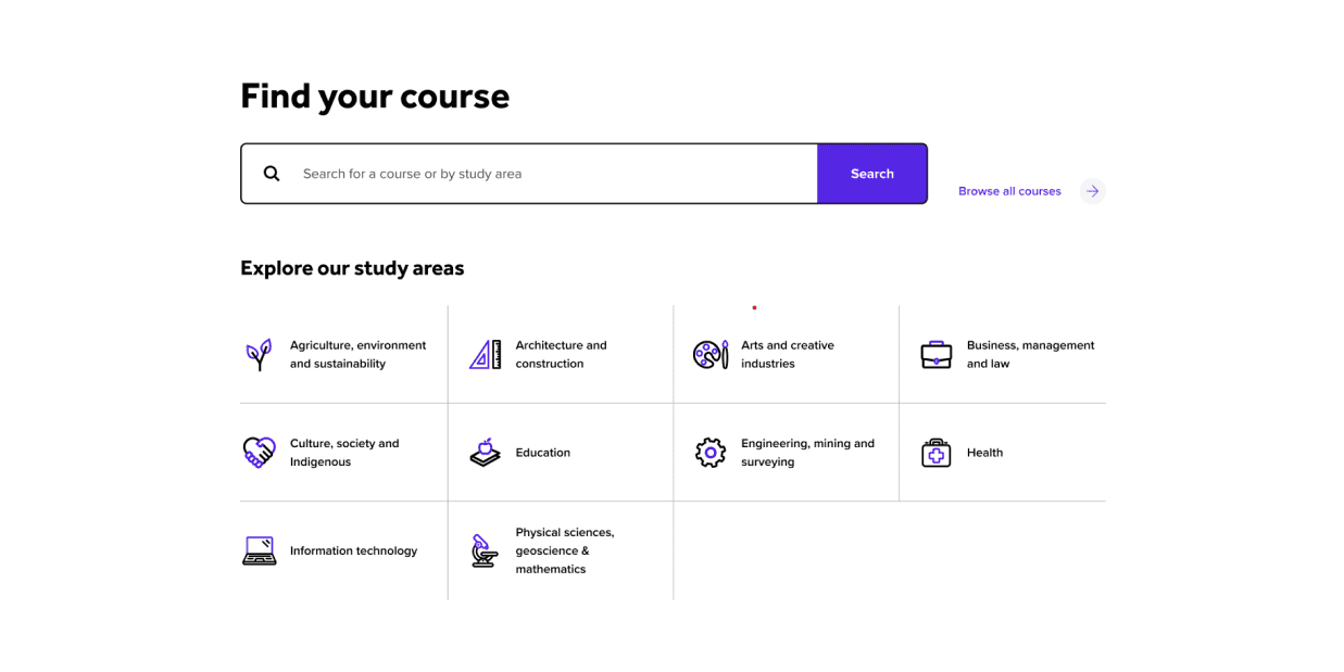
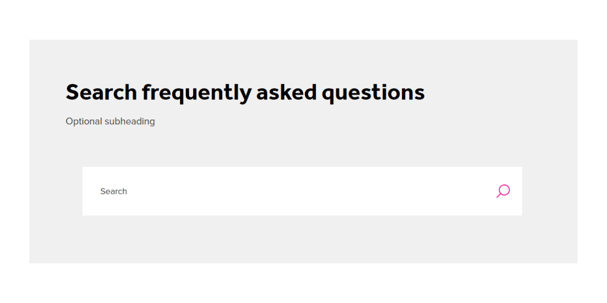
Search Bar
The newly designed search bar aims to make finding content on our website much easier.

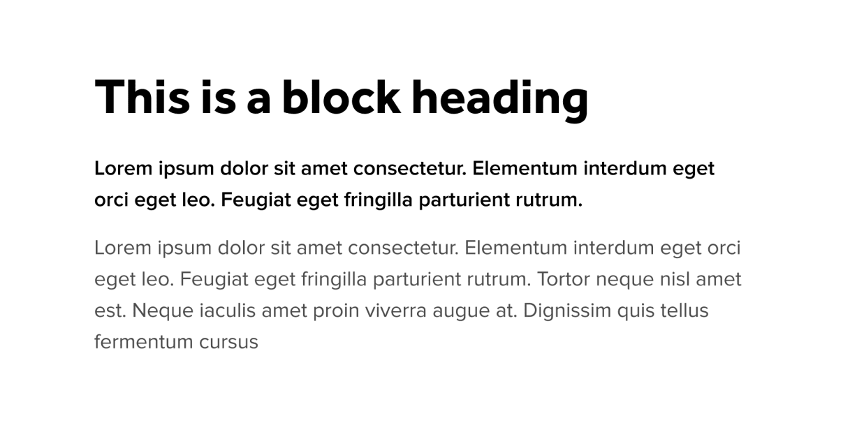
Styled Heading
Styled headings introduce a new section or block and guide the reader through your landing page.
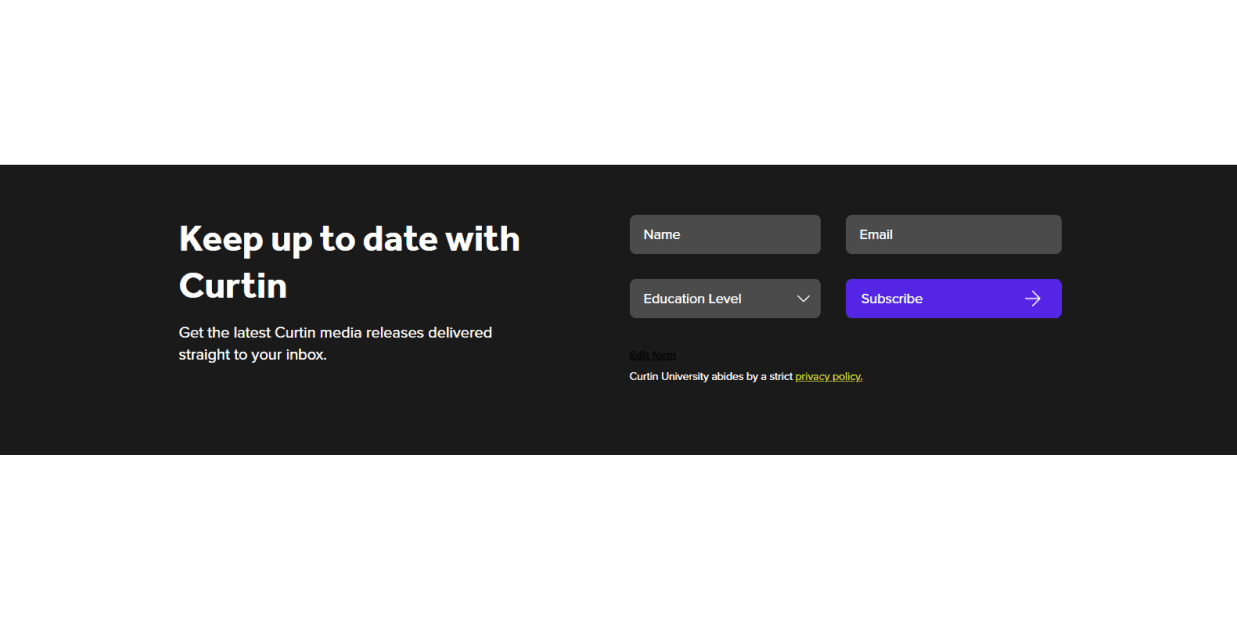
Subscribe
The Subscribe block is used as a call to action to subscribe to a specific mailing list.
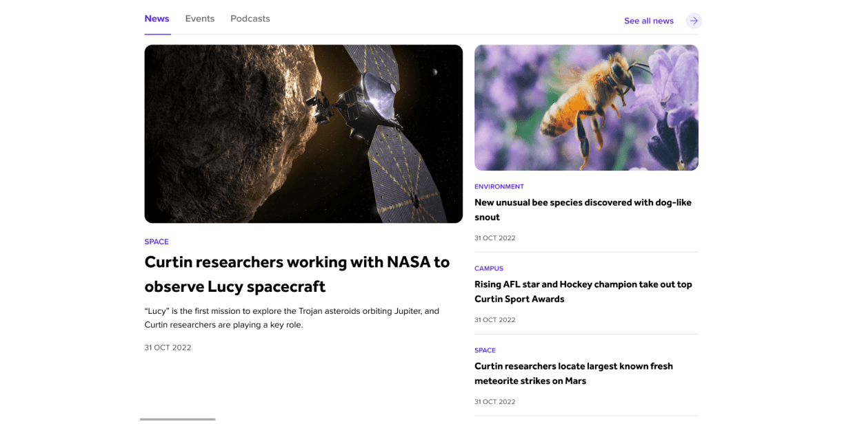
What’s on
Display events, news and/ or podcasts on landing and campaign pages and content is updated manually.
Event cards
Display multiple events in a card array with three styles of cards this block follows the same guidelines as the Cards block.