Modal
Modals are used to display supporting content on a page. A modal is similar to a pop-up, however it is only displayed when the user clicks a link or button for a modal.
Guidelines
- Use modals to display supporting content, forms, or secondary information.
- Modals must use a unique id to function correctly.
- Modals can be activated using a shortcode, a link, button, or via a URL parameter.
Examples
Modal activated with a link
Modals are created in the page components section of the WordPress editor. Once created, a modal can be linked on the same page using the link URL format: http://:modal=my-modal-id, where ‘my-modal-id’ matches the unique id of your modal. You can link to a modal anywhere you would normally add a link.
This is a modal example using hyperlinked text.
Shortcode
A shortcode can be placed on the page to activate the modal by using the following shortcode format: [ modal id=”my-modal-id” label=”a shortcode” ] (remove spaces).
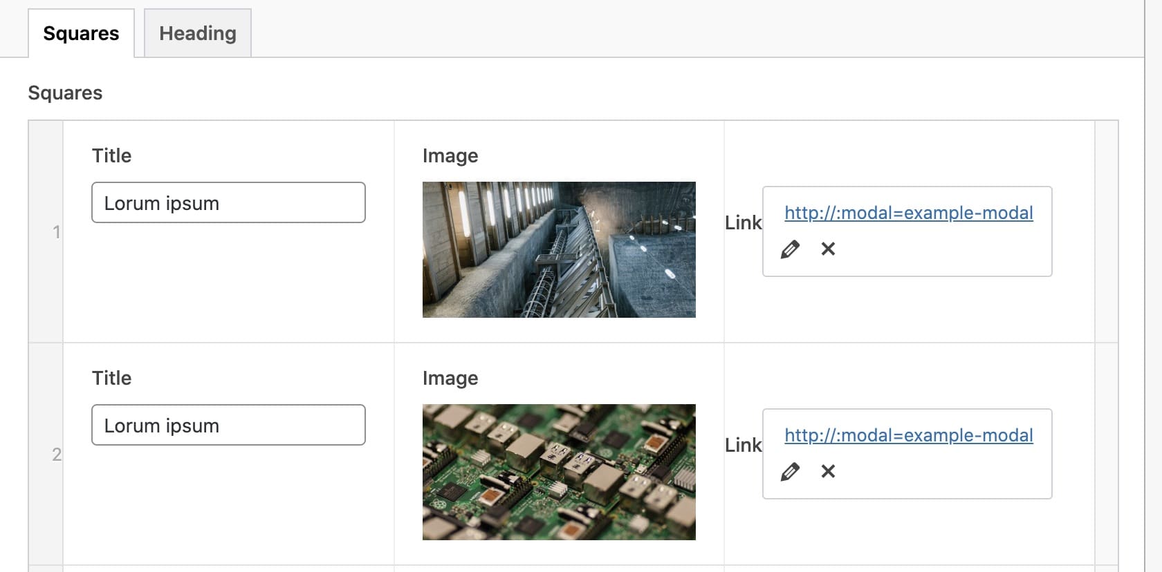
CTA Squares with modals
Modals are commonly paired with the CTA Square block on the Curtin websites. To achieve this, simply link to the desired modal in the block options for each square.


Modal-activated URL parameter
A modal can be opened on page load by adding the modal id to the page URL. For example, this link will open in a new browser tab and display the example modal. You will notice the URL has the modal id at the end /#modal-example-standard.