Logo
The symbol of Curtin University is based on a traditional shield image, which has been given a contemporary look.
The shield in the Curtin logo is drawn in two halves cradling a hexagonal form. It’s derived from the original Western Australian Institute of Technology symbol. The hexagon is positioned within the shield with the uppermost point breaking out, giving a feeling of movement and growth.
This hexagonal form also appears to expand out of the supporting ‘hands’ of the shield, reinforcing the notion that Curtin is a progressive and innovative University.
The corporate Curtin logo is a very important asset of the organisation. It provides a legal trademark and guarantee of quality for all the products and services that carry the mark. It’s also the visual expression of the brand and as such must be valued and used in accordance with these instructions.
If you require a copy of the Curtin logo, please contact University Marketing, including in your request whether this is for internal or external use, the format of the logo required (eps/jpg) and where the logo will be used.
Guidelines
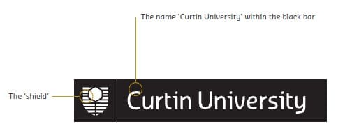
The corporate logo is made up of two elements, locked together in a predefined arrangement:
- The name ‘Curtin University’ within the black bar
- The ‘shield’
It should never be altered from its original format or embellished with other symbols or colours.
Master logo – colour positive
For use in colour applications.
Sizes
- Minimum: 25mm
- Recommended: 30mm
- Minimum for digital use: 180px x 30px

Master logo mono variants
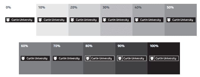
When it’s not possible to use the full-colour logo, use the Curtin logo mono positive. On light backgrounds where the tonal value is below 80 per cent, the mono positive version should be used.
The minimum allowable contrast between the logo and background should be at least 80 per cent tonal value.
Master logo mono positive
For use in monochromatic publications.

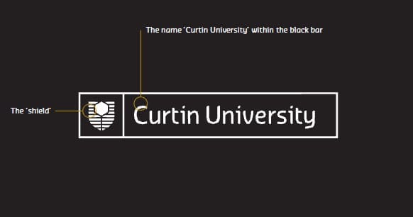
Master logo mono positive with keyline
For use in monochromatic publications.


Logo sizes for advertisements
This table outlines the recommended logo size on certain press, print and digital executions.
When developing out of home executions, the logo size should be proportional to the sizes listed here. However, this should be be reviewed and approved by an art director on a case-by-case basis.
Newspaper advertising
| Document size | Logo width | Distance from base |
|---|---|---|
| Full page (40 x 7 columns) | 70mm | 11.5mm |
| Half page (20 x 7 columns) | 70mm | 11.5mm |
| 10 x 7 columns | 56mm | 9.5mm |
| 5 columns | 63.5mm | 10.5mm |
| 4 columns | 50mm | 8.5mm |
| 1 column | Entire column width | 7.5mm |
Magazine/ print advertising
| Document size | Logo width | Distance from base |
|---|---|---|
| A4 portrait | 60mm | 10mm* |
| 360mm x 265mm | 58mm | 9.5mm* |
| 275mm x 200mm | 56mm | 9mm* |
| 45mm x 260mm (Spress strip) | 44mm | 7.5mm* |
Digital advertising
| Document type | Logo width |
|---|---|
| MREC | 171px |
| Leaderboard | 162px |
| Skyscraper | 150px |